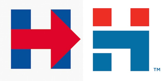
Hillary Clinton’s campaign logo looks a lot like Hadassah’s new logo
Published April 15, 2015
Critics love to nitpick Hillary Clinton’s personal and policy choices, as they have during the recent email scandal and the Benghazi scandal.
This time, however, the critics may have a substantial case against her.
As soon as Clinton’s campaign was launched on Sunday, her campaign logo was lampooned from all sides. Some called it too simple, others thought it looked too corporate.
Some were just confused that it features a red arrow pointing to the right – a feature that seems to contrast the blue and “left” tropes of the Democratic party.
However, no one seems to have noticed that the logo shares an awful lot in common with Hadassah’s new logo, which was unveiled in January.
The logos share the capital letter “H,” the red and blue color scheme, and an angular, geometric style.
But Hillary’s logo isn’t the first Democratic one to resemble a Jewish symbol. Is it just a coincidence that the current Democratic Party logo looks like the Orthodox Union hechsher?
Maybe Hadassah officials are secretly hoping that their organization could get an unexpected PR boost, just as they hoped they would back in 2000, when then-vice presidential nominee Sen. Joe Lieberman’s wife Hadassah helped get the name into the mainstream media.
![]()


