Everything you need to know about the paper’s redesign
Published April 20, 2017
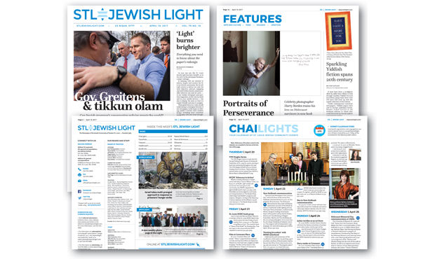
As you can see, the St. Louis Jewish Light has had a facelift, or as we call it in the newspaper business, a major redesign.
In keeping with our mission to inform, inspire and connect the St. Louis Jewish community, the Jewish Light strives to deliver not only the most objective, relevant, engaging and well-written Jewish content possible wherever you look for news — in our weekly newspaper and quarterly magazines, on the web, by email and on your mobile devices — but also to display the news so that it is reader-friendly and easy to navigate.
These goals led us to a nine-month undertaking to reimagine the look of our newspaper, in the hopes of offering readers a fresher, more modern design, including more consistent typography, with new fonts throughout. Even the paper stock has been upgraded to ensure better readability; the whiter paper improves the contrast of text in the paper, making stories much easier to read, and offers a crisper look to photos, graphics and advertising content, making the color more vibrant and eye-catching.
In addition, our logo and nameplate has been streamlined and modernized, thanks to the efforts of Light Board members Gary Kodner (a past president of the Light) and Rachael Staenberg Brightfield, both of whom are first-rate graphic artists. This change incorporates an updated, cleaner font and a Shield of David icon, which is intended to respect Jewish tradition. Blue and white are colors of major significance to the Jewish people, from the fringes of the tallit to the flag of the State of Israel.
Before we get into the details of the changes so that you have a better understanding of what to expect, I’d like to thank the Redesign Task Force, led by Joan Silber, for all their hard work. Task force members from the Jewish Light Board of Trustees include outgoing President Jane Tzinberg Rubin, Vice-President Jeff Golden, Alice Handelman Ed Musen, Judi Scissors, Melanie Paticoff, Diana Iskiwitch and Ben Lipman, along with Kodner and Brightfield. Light staffers integral to the process include Managing Editor Mike Sherwin, Director of Operations Tom Wombacher and graphic artist Martin Holloway.
Since the paper’s original founding as the St. Louis Light in 1947, and its reorganization in 1963 into an autonomous, independent newspaper, the St. Louis Jewish Light — as is the practice at most newspapers — has undergone several major format revisions over the years. However, the last major redesign was more than a decade ago.
“As the consumption of news media has evolved, it was clear the Light products needed updating as well,” explained Tzinberg Rubin. “Although instigated by the Board, extraordinary staff effort, supplemented by skilled and involved Board members, resulted in a unique and highly effective Board/staff working relationship.
“We decided to start with our most popular product — our newspaper — and will continue with the revision of our website and other e-products shortly. As the Light impacts more Jewish households in our community on a weekly basis than any other vehicle, it is essential our products be as informative as possible.”
As a nonprofit Jewish newspaper, the Light receives revenue not only from subscriptions and advertising sales but also from grants and donations from other nonprofits and foundations as well as from individuals. Many thanks to the Jewish Federation of St. Louis and the Silk Foundation for their kind donations in helping the Light with its redesign efforts. In addition, the Staenberg Family Foundation made possible much of this major redesign by providing generous sponsorship of a new weekly Spotlight page featuring pictures and captions of many of the events happenings each week in the local Jewish community.
“The Jewish Light is unique in that it is the only news source that provides comprehensive coverage of the local Jewish community as well as national and international Jewish news,” said Michael Staenberg, founder, along with his wife, Carol, of the Staenberg Family Foundation. “I don’t think people realize the cost of publishing and distributing a high-quality Jewish newspaper like the Light that is independent and nonprofit. That’s why we chose to sponsor the Spotlight page — we feel it an excellent way to showcase all the good things people in our community are doing.
“I would encourage others to support the Light as well,” Staenberg continued. “This effort doesn’t have to be thousands and thousands of dollars. They could sponsor a Light intern, or a weekly or monthly page in the paper, or become a member of the paper’s Publisher’s Society. Enough smaller amounts can make a big difference in ensuring the Light’s overall financial health and robustness over time.”
In this week’s News & Schmooze (now on Page 3), I talk more about donor and other opportunities for readers and advertisers to become more involved in the Light. But now, I’d like to explain other changes you can expect in the new, redesigned Light moving forward:
A more user-friendly format
• Each page notes the section at the top of the page, clearly denoting which pages are local news, world news, editorial opinions and other viewpoints, etc.
• Each week, Page 2 will include contact information for a variety of common Jewish Light inquiries (circulation/subscriptions, advertising, editorial department inquiries, obituaries, simcha announcements, etc.)
• Obituaries now includes an index of all names listed that week
• Email addresses included for Jewish Light writers, encouraging reader feedback and participation
***
Better use of photos/graphics
• Our new design opens up pages to allow for use of larger images
• Enhanced front page photo and story provide a more contemporary magazine look
• Emphasis on including more photos throughout the paper
• Weekly Spotlight community photos page, generously sponsored by the Staenberg Family Foundation, offering a full page of images each week of Jewish life at St. Louis synagogues and organizations as well as other social events. Email photos and a suggested caption to: [email protected].
***
Complete overhaul of the ChaiLights calendar
• More graphics to add visual interest to the page.
• Icons with listing to indicate events that are free, family-friendly, include food and/or need a RSVP.
• Event addresses are listed in a box at the bottom of the page, eliminating redundancy of including addresses for events occurring at the same location.
***
Our new Page 2
• Offers a quick pictorial look at key stories inside the paper and notes additional features available online (stories, photo galleries, videos, polls, etc.)
• Consolidates several items previously scattered throughout the paper, including:
– Newspaper index
– Candle-lighting times for Shabbat and Jewish holidays
– Corrections and clarifications
– Masthead (listing of staff, freelancers and board members)
***
Moved to new locations in the paper
• News & Schmooze – now on Page 3
• Yiddish word of the week and Jewish trivia — now on the Jewish Lite page with the weekly crossword puzzle.
In addition, the Light is adding new content, including a Jewish celebrity column every other week. Instead of Mishpacha, the Light’s monthly section dedicated to parenting, the paper will include parenting content regularly in its features section. Readers can also expect more arts, entertainment and food coverage, along with intermittent installments of Editor-in-Chief Emeritus Bob Cohn’s Cohnipedia feature about St. Louis Jewish history. Special sections such as Israel Alive! and Women in Business also will be part of the mix, and new ones will be added in the coming months.
We are also hoping to beef up two other sections:
• Opinions: We invite community members to offer their views and insights on issues to reflect the diversity of community thinking on issues of importance. Email [email protected] for more information.
• Simchas: Our page highlighting celebrations such as bar and bat mitzvahs, wedding and engagement notices and anniversary and birth announcements. For information on submitting simchas online, visit stljewishlight.com/simchas.
“We look forward to receiving and publishing more photos from the community and encourage more submissions of celebrations — births, engagements, weddings, and anniversaries,” said Silber, who led the Redesign Task Force. “With this new look, readers will be able to enjoy a whole new up-to-date feel for the paper, including a new front page header, boldly identified sections, an increase in photos of community events, an easier to navigate community calendar, a clearly identified area for letters to the editor, email addresses for contributors, links to online content, overhauls of the front and second pages, improved space and placement for advertisers.”
Each time a newspaper undergoes a redesign, some readers initially object because they are used to the old format. That’s understandable. Generally it takes a month or two for readers to acclimate to the new format. Like all dynamic publications, we are a work in progress: If we find something is not working, it can always be changed. We also encourage your feedback and suggestions. Please tell us what you think by contacting me at [email protected] or calling 314-743-3669.


