

Book chronicles evolution of Cardinals logos and uniforms
Published January 4, 2017
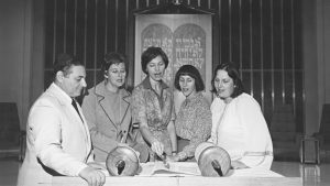
If you want to know how the “Birds on the Bat” logo — among the most iconic in all of baseball — got its start, you can thank the creativity of a woman named Allie May Schmidt – as well as two real-life cardinals that happened to alight on a branch in her backyard.
“She decided she would take cardboard and cut out little cardinal birds, hand paint them and attached them with string to make them look like they were perched,” said author and graphic designer Gary Kodner, who noted that the pieces were used as a table decoration for a luncheon hosting the team’s then-manager Branch Rickey. “Rickey thought these red birds sitting on these white tablecloths were so striking that he said, ‘That’s what I want the Cardinals uniforms to look like next year.’”
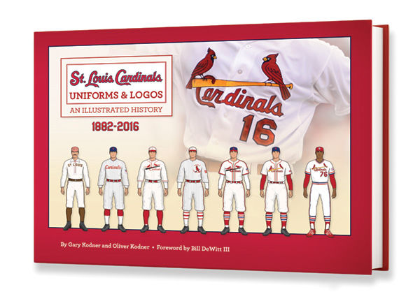
Kodner, a graphic designer and Kol Rinah congregant, delights in regaling others with such anecdotes. Now any Redbird fan can do the same thanks to the release of “St. Louis Cardinals Uniforms & Logos: An Illustrated History,” the new book that Kodner, 62, co-authored with his son Oliver.
From the team’s first jerseys in 1882 until the present day, the work chronicles the evolution of both its clothing and its iconography over the years.

“When you see any kind of online surveys or people who are pundits in the uniform and professional logos business, the St. Louis Cardinals logo always comes up on the top of the list as the best-looking graphic in major league sports, which is something to be proud of,” said the elder Kodner.
In fact, Kodner can be particularly proud since he’s played a role in the very history he chronicles. As a consultant for the team, he refined the present “birds on the bat” logo in the late 1990s. His 120-page full-color work, packed with more than 300 drawings and 400 photos is an exhaustive look at the legendary franchise through the lens of the graphics.
“This book is not just a narrative or a history. This book is loaded with our original drawings,” he said. “We redrew every single iteration of every uniform that the Cardinals have worn since 1882 and we went back into every logo and reconstructed it.”
The Kodners’ initially got the idea for the book due to the current fad of retro looks and nostalgia in Major League Baseball.
“People like to press old logos on caps and shirts and various other promotional items and we were noticing that a lot of them were incorrect,” said Gary Kodner. “Many of the retailers and licensees who manufactured those goods were sort of guessing on what those graphics looked like.
The important thing for Kodner was to ensure that every change or alteration in Redbird garb was chronicled so that his book could be the authoritative work on the subject.
“The more we explored, the more we discovered that there were multiple versions,” he said. “In some seasons, they’d have four or five uniforms within a specific season. We found some interesting one-offs that we didn’t even know about before.”
Soon, they found themselves pitching a book to the Cardinals, which were receptive to the idea.
“We were really fortunate that the Cardinals have a president in Bill DeWitt who cares about this stuff,” Gary Kodner said. “Many Major League owners would not even want to waste their time on it. But to him history is vital.”
That history began with a team then known as the St. Louis Browns in the late 19th century. But in 1899, their uniforms switched from brown to red and the ownership renamed the squad the “St. Louis Perfectos.” The name didn’t stick but the hue did especially after a sportswriter mentioned that he’d overheard a woman comment on the “lovely shade of cardinal” that the team was now wearing.
“The curious thing about the Cardinals is that the name of the ballclub did not come from the bird,” Gary Kodner said. “It was not bird-related. It came from the color. A lot of people don’t realize that.”
The birds on the bat made their debut in 1922 thanks to that table decoration. The insignia has remained remarkably consistent, only rarely disappearing since its introduction.
“The logo has been the same logo, the same general design,” Kodner said. “It’s just a great design, from a color standpoint, from a design standpoint, the way it wears across the chest. It has just been perfect.”
But perfection has also been tweaked from time to time.
“We discovered in 1923 that all of the sudden they had a single bird on a twig on the front of the uniform,” he said. “No one thought that ever existed. We have found photographs that verified that it happened and again, we’ve corroborated it with newspaper stories that describe it in detail.”
Similar thoroughness was put into investigating the green stripes on the 1927 road uniform.
“People will say that’s absurd. That couldn’t have happened or shouldn’t have happened but it did happen,” said Gary Kodner. “We have newspaper documentation that describes it and we also know a collector who has one.”
Some changes over the years may owe more to error than to planning. Before digitization and computers, the stitching of a logo could be an inexact business. The cap’s famous entwined STL began life as a simple SL around the turn of the century and the word “Cardinals” didn’t appear on the uniform until near the close of World War I.
Oliver Kodner, 23, said he recalls seeing his father’s contributions to the logo come to life.
“As a little kid, I actually saw a lot of this work being done,” he said. “I saw the birds coming together. I saw the graphics being made.”
His father is glad they found a subject no one else had done.
“There have been many, many, many titles, books, stories and legends written about them but no one has ever written about the uniforms or the logos,” Gary Kodner said. “It was kind of neat that we found a topic that had never been covered.”